Travel Guide App
Guiding anyone through new places in a very simple way.
Challenges
- Unfamiliar location
- Find suitable options
- Great amount of information
Goals
- Act as a guide
- Personalized suggestions
- Very simple to use
personas
The two personas presented here represent the main division within the app. They are the basis for the suggestions that are going to be made.

Name: Ricky
Age: 27 years old
Profession: Developer
“I want to immerse in the local life”
Description
Ricky likes to choose travel destinations spontaneously.
One of his premises is traveling on a low budget because he is a minimalist.
Besides that, being a solo traveler with a flexible schedule allows him to socialize with the locals.
He is also pretty active and always looking for some adventures.
Needs
- Walking tour and meetings
- Parks around the city
- Nightlife bars and clubs

Name: Emma
Age: 46 years old
Profession: Doctor
“I want to see the local life”
Description
Emma enjoys traveling but doesn’t like to make very detailed plans.
As she travels with her family and everyone has different tastes, there is the need to have several options to please them all.
The schedule is often tight, but the capacity to afford anything needed or wanted makes it worth it.
She always expects the trips to serve an educational purpose.
Needs
- Search for historical sites
- Best places in downtown
- Different viewpoints
User journey map

Ricky Traveler
Scenario: Ricky is a traveler that doesn’t know what the city has to offer.
He needs some guidance in order to accomplish his needs.
Expectations
- Suggestions on different topics
- Ability to chose specifically
- Easy and quick process
aware
1. He has no idea about what he can do in the city
2. Checks his app to have some help and guidance
explore
3. Starts to click on relatable options that show up
4. During the process are revealed related topics
consider
5. Gets an overview of his choices
6. There is the option of changing them
select
7. Decides to accept the suggestions made

Information Architecture
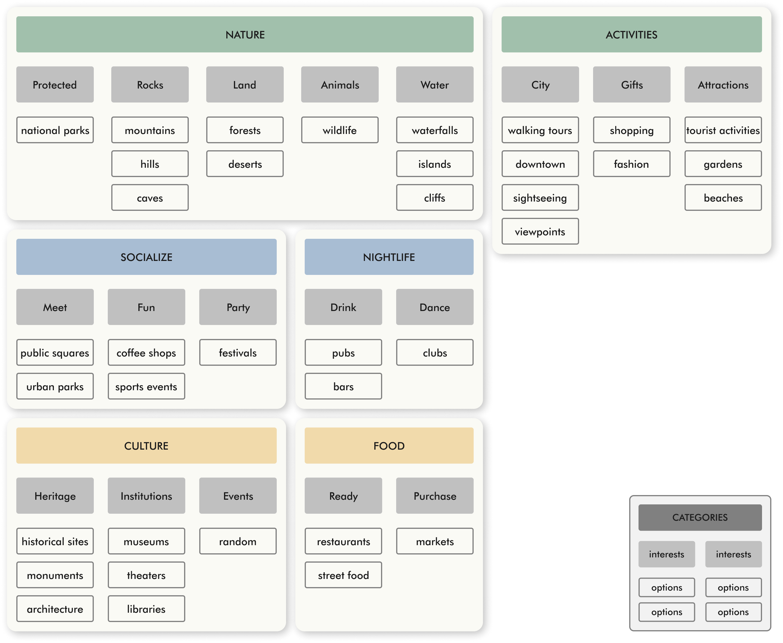
The connection between the different options is very simple. It's done linearly, as each new suggestion is based on the choices made previously. However, it is possible to go back and make any desirable change.
sitemap & user flow
Everything was designed keeping in mind the possibility of expansion in the future. Choosing between backpacker or traveler is going to influence all the information shown next.

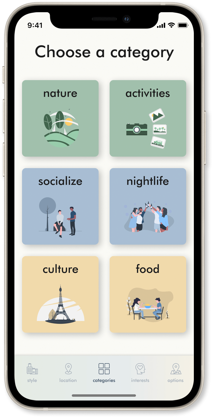
The several options are condensed into 'categories', 'interests', 'places', and the same colors represent proximity between them.
Wireframes
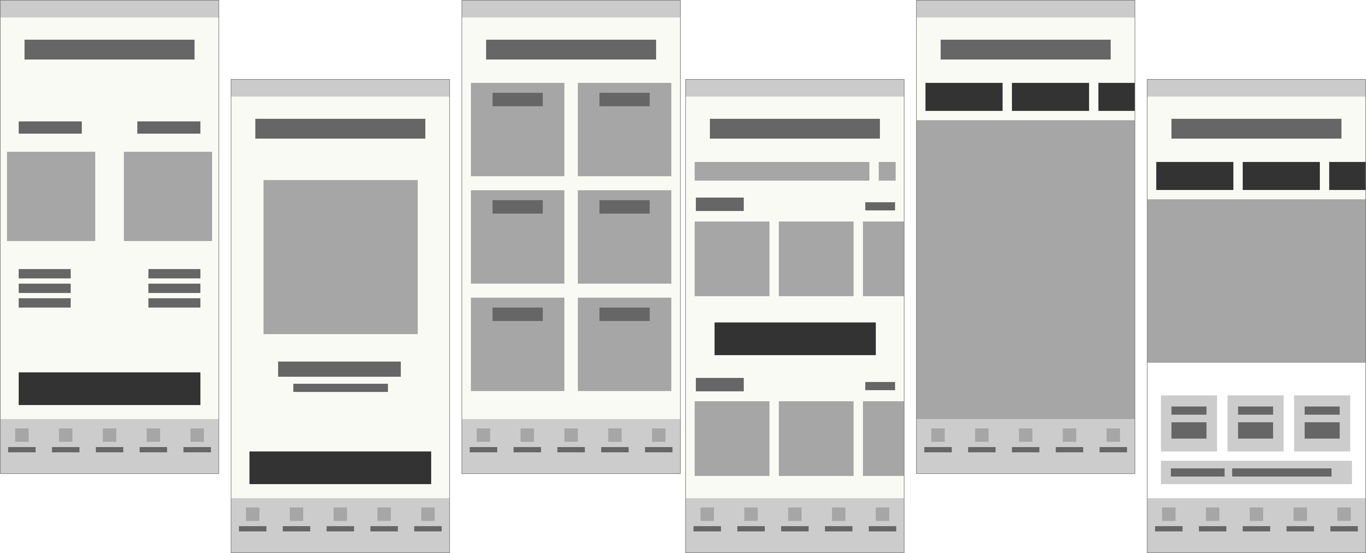
A mix between sketching and more rigorous wireframing helps to achieve results in a fast and better way. The sketches, which give a lot of freedom and speed, are then adjusted in the digital space.

Visual Design
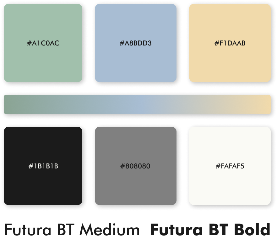
The choice of these colors is related to the planet Earth. Seen from space, the colors that stand out are precisely blue, green, and yellow.
Prototypes
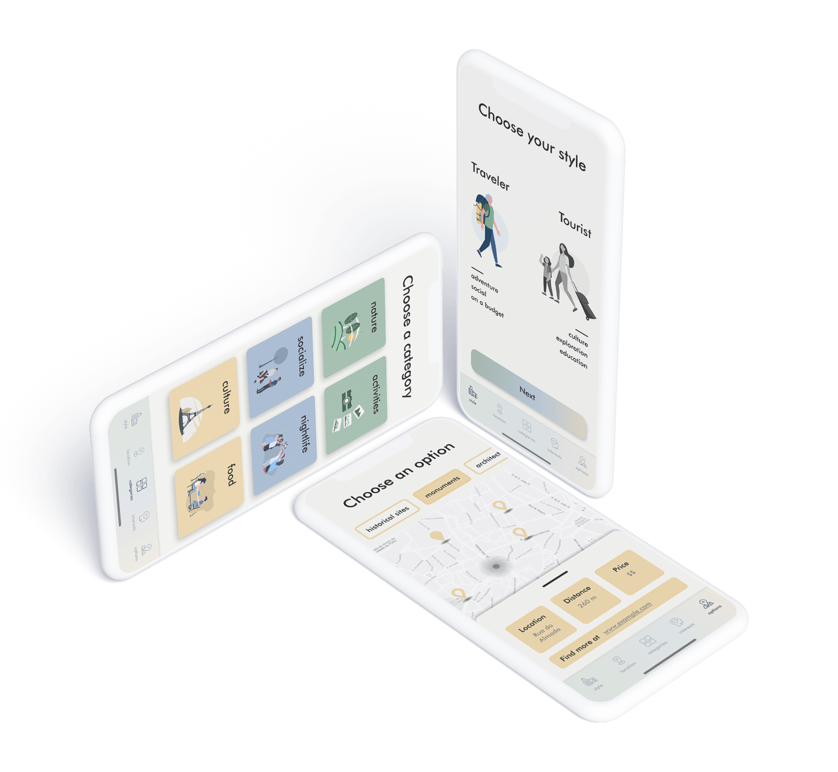
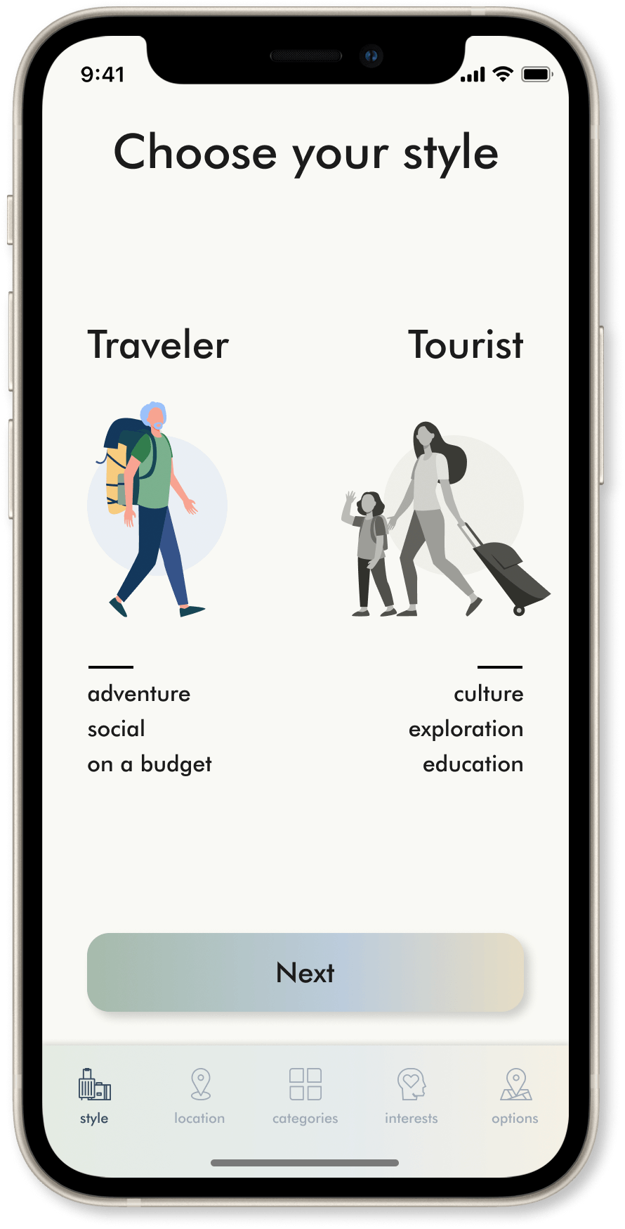
First, we choose the personality type that most closely matches us.
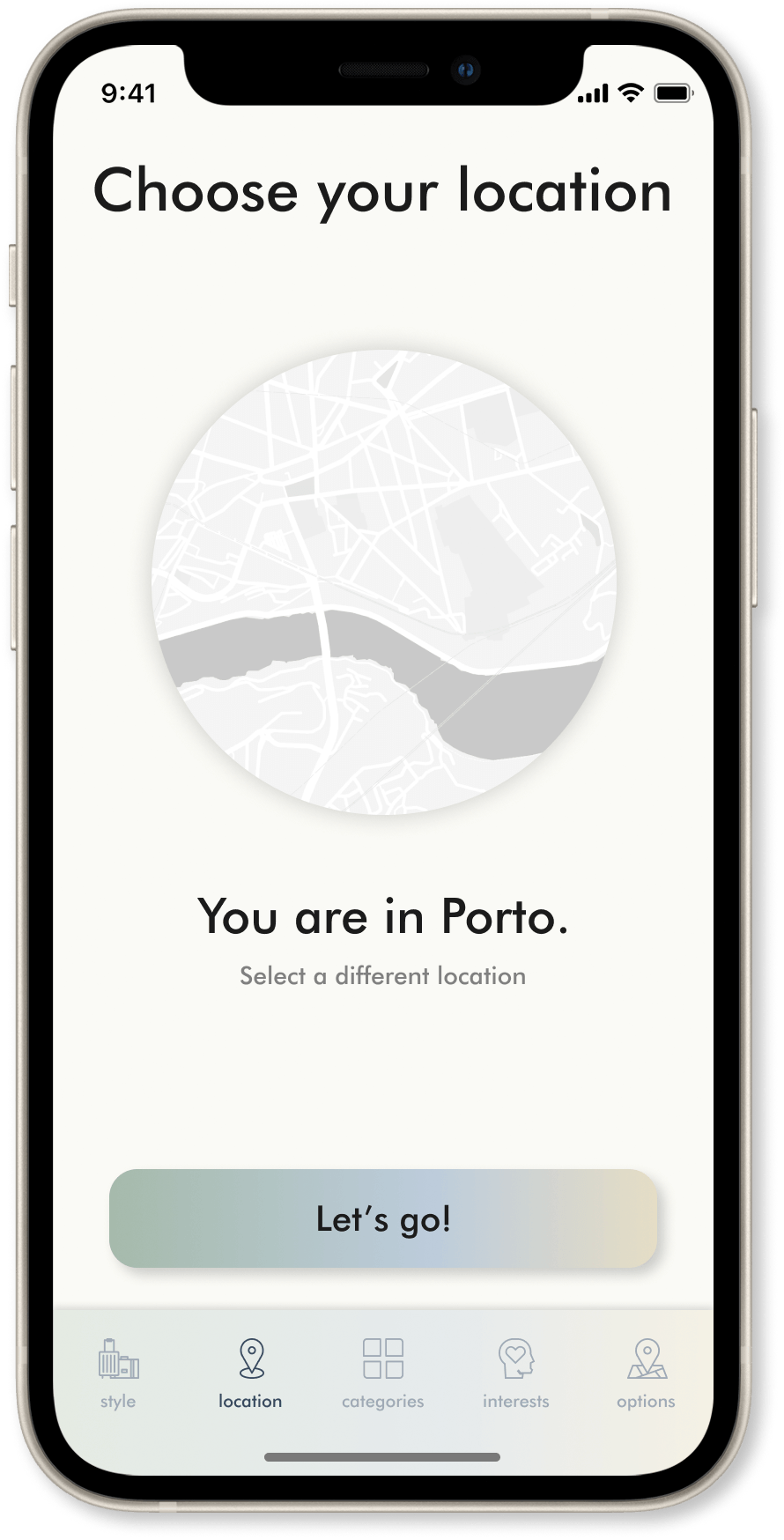
Then location is indicated by the GPS but can also be changed.
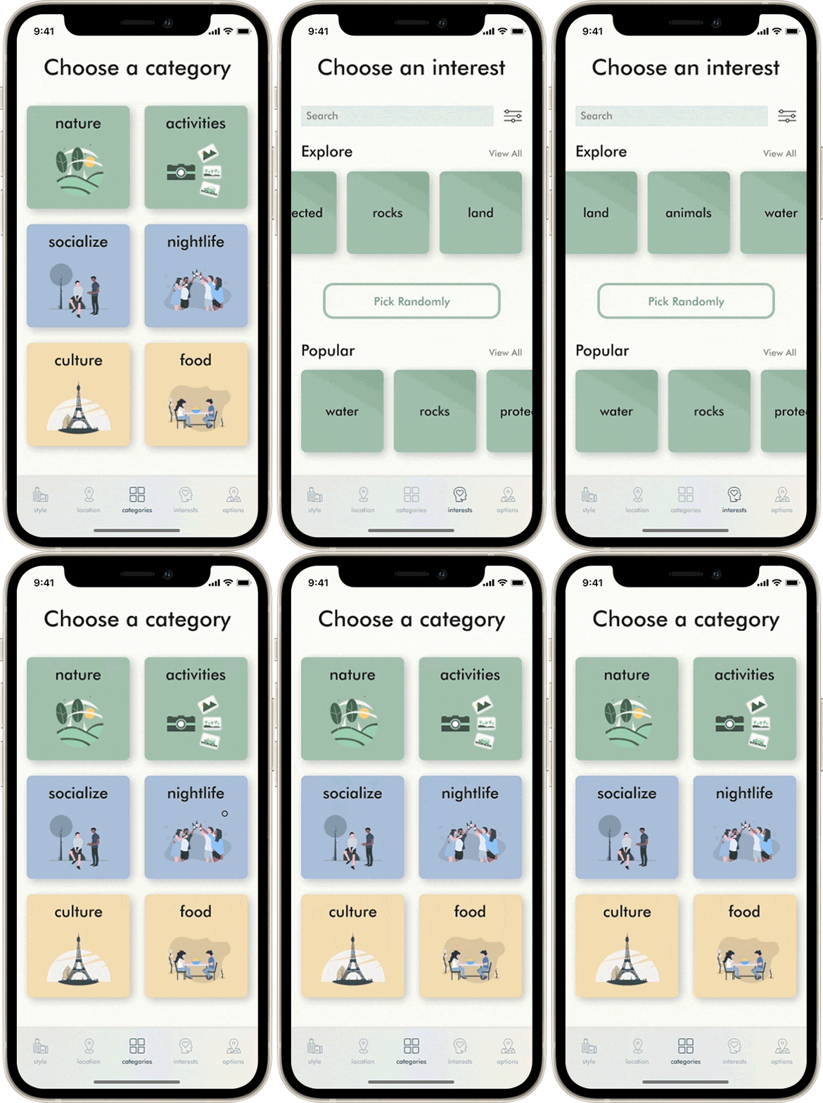
After that, it is time to choose the prefered category.
We can be specific or ask for a random choice.
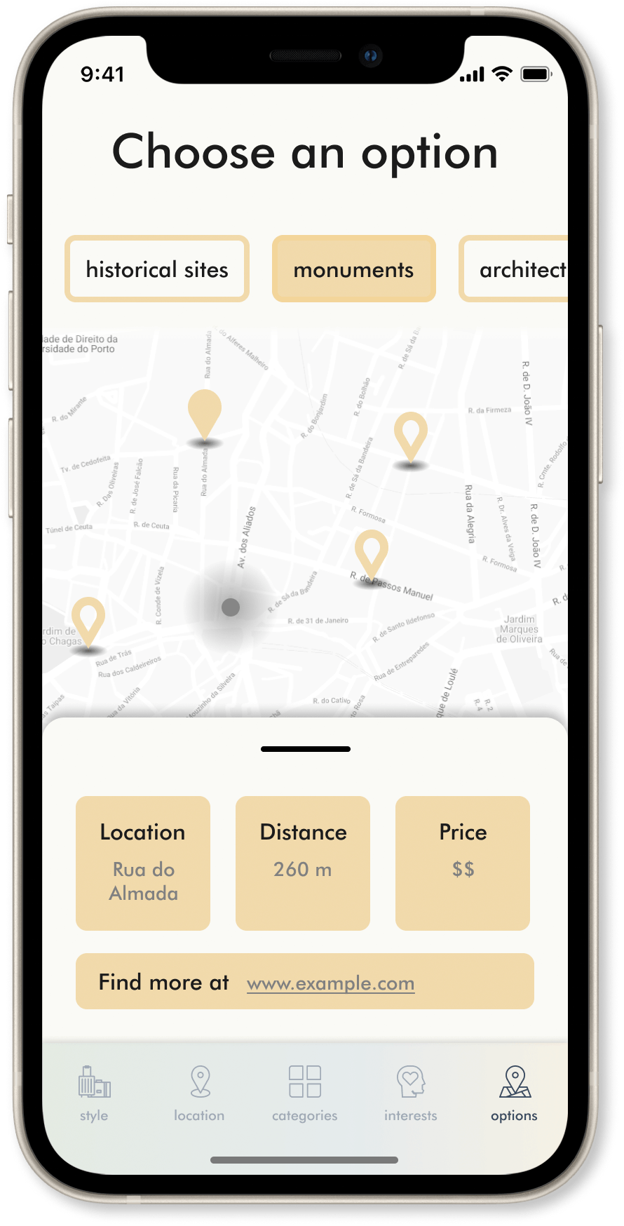
Lastly, we choose our favorite option.
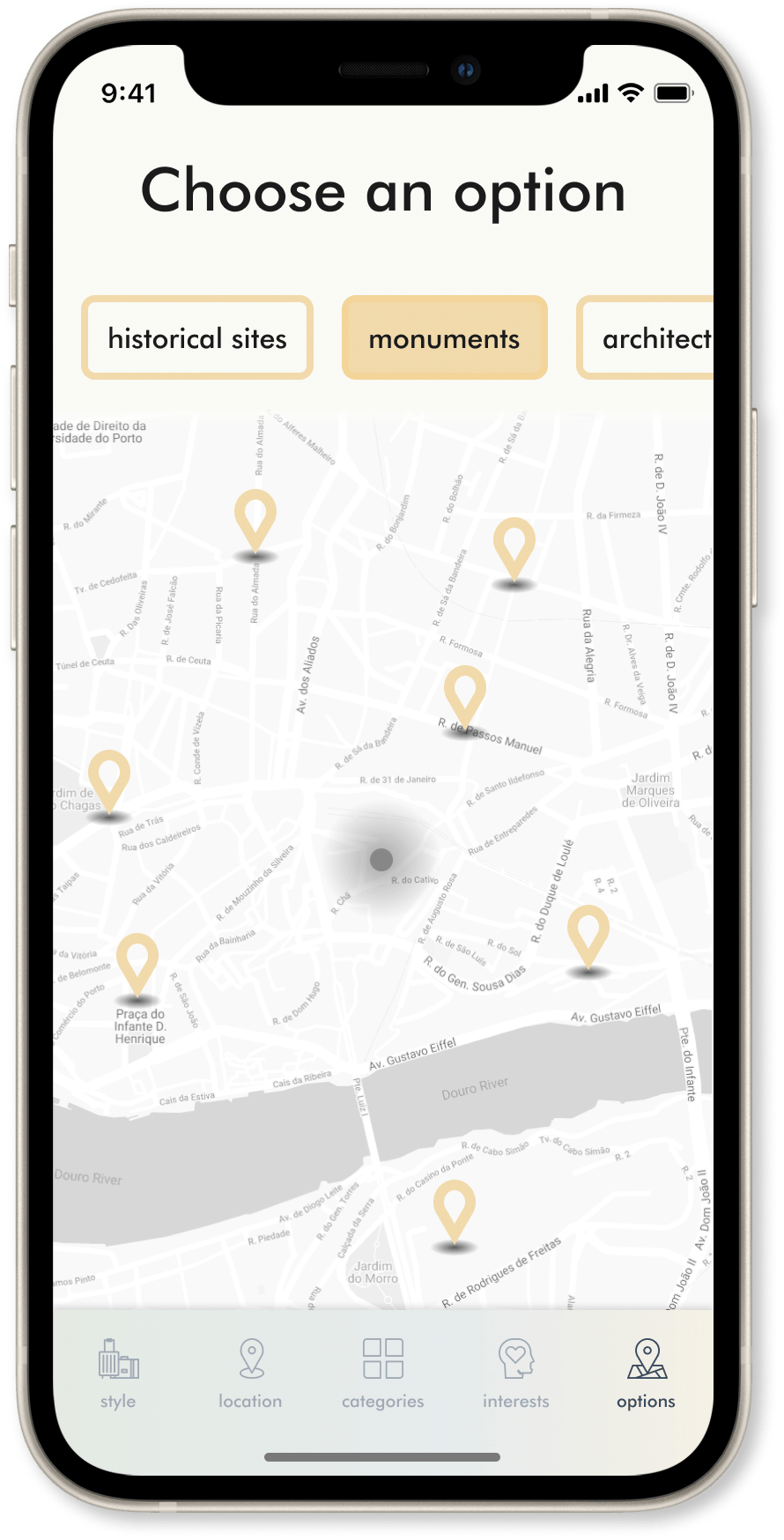
And select on the map what we want. That's it!
What I learned
- Choosing the colors that look and feel right can take time and can transform the UI a lot. During the process, I learned more about color correction and solidified my color theory knowledge.
- Illustrations are great besides being trendy. I had started with photos but then changed to illustrations because I felt it was less specific but just right enough to transmit the message needed.
- It would be great to do more user testings. Until now, I have just done it with friends of mine, but I feel it is not enough. Doing so would add value, I believe.
