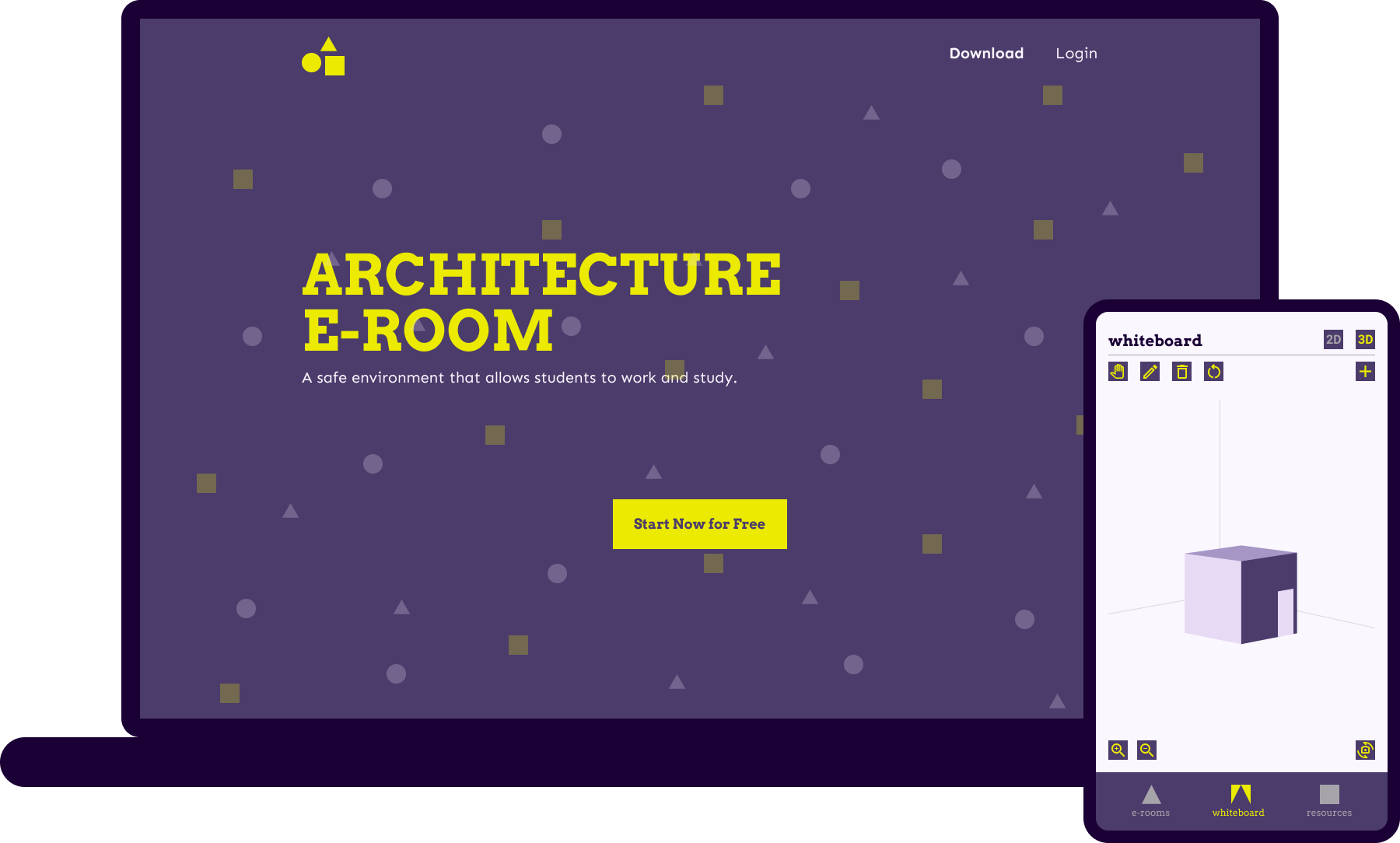
Architecture E-Room
A safe environment that allows groups of students to work and study
Challenges
- Pandemic crisis
- Need for study rooms
- School work doesn’t stop
Goals
- Atelier environment
- Work groups
- Help and discussion
concept
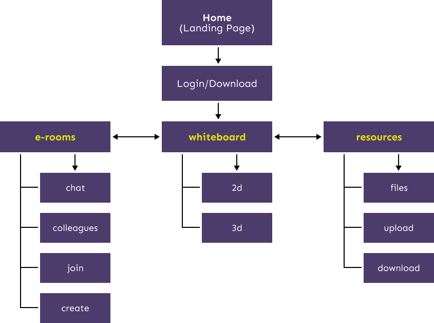
The main idea was to create electronic rooms where students can gather together and work.
With the legendary quote "Less is More" in mind, from the architect Mies van der Rohe, I decided to use simple basic geometric plan shapes.
Everything is, at least, contained in one of the following four shapes: square, circle, rectangle, or triangle.

The predominance of straight-edged elements in the layout composition is influenced by architectural plans and is used to pass that message across.
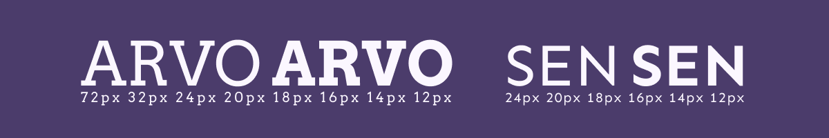
typography
The typography choice is a combination of Serif and Sans-Serif fonts. This way, there is space for the old and the new, like in architecture history.
colors
The chosen colors induce emotions and meaning derived from psychology. Some of them are wisdom and fun.
personas

Gary Arch, 21 years old, architecture student
"I want to keep learning and studying as if I was in school."
About
Gary is a college student doing a master's degree in architecture.
Because of the pandemic crises and subsequent lockdown, he cannot gather with his colleagues to work on the group assignments.
There is also a necessity to have access to several resources to work and have the same efficiency as when he was in a normal classroom.
He also likes to share the knowledge he acquired during his working process and values its colleague opinions.
Needs
Socialize and support; Design with colleagues; Exchange of ideas
information architecture
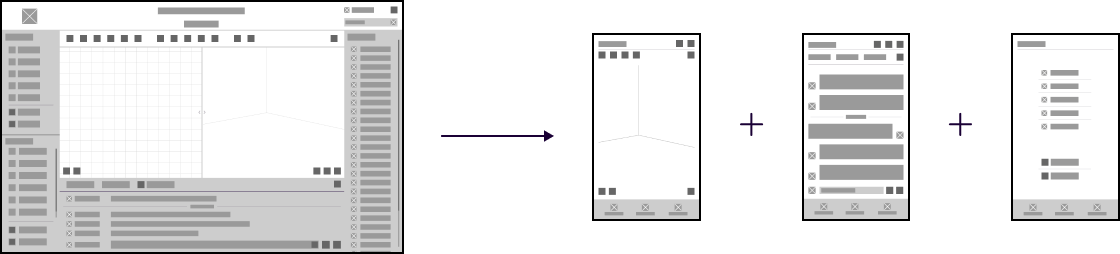
wireframes
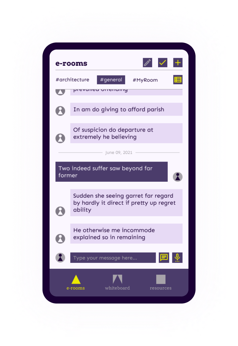
The wireframes are thought and planned according to responsive web design principles. They can adapt to several screen sizes having the developer's work into consideration.
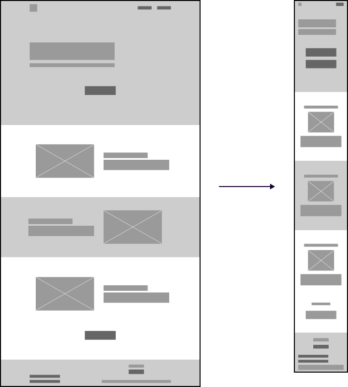
The layout and organization differ from laptop to phone, but the functionality is always maintained.
prototypes
The main focus of the landing page is obviously to make the user start using the web app. It provides a simple explanation of what is the e-room about and focuses on the CTA.
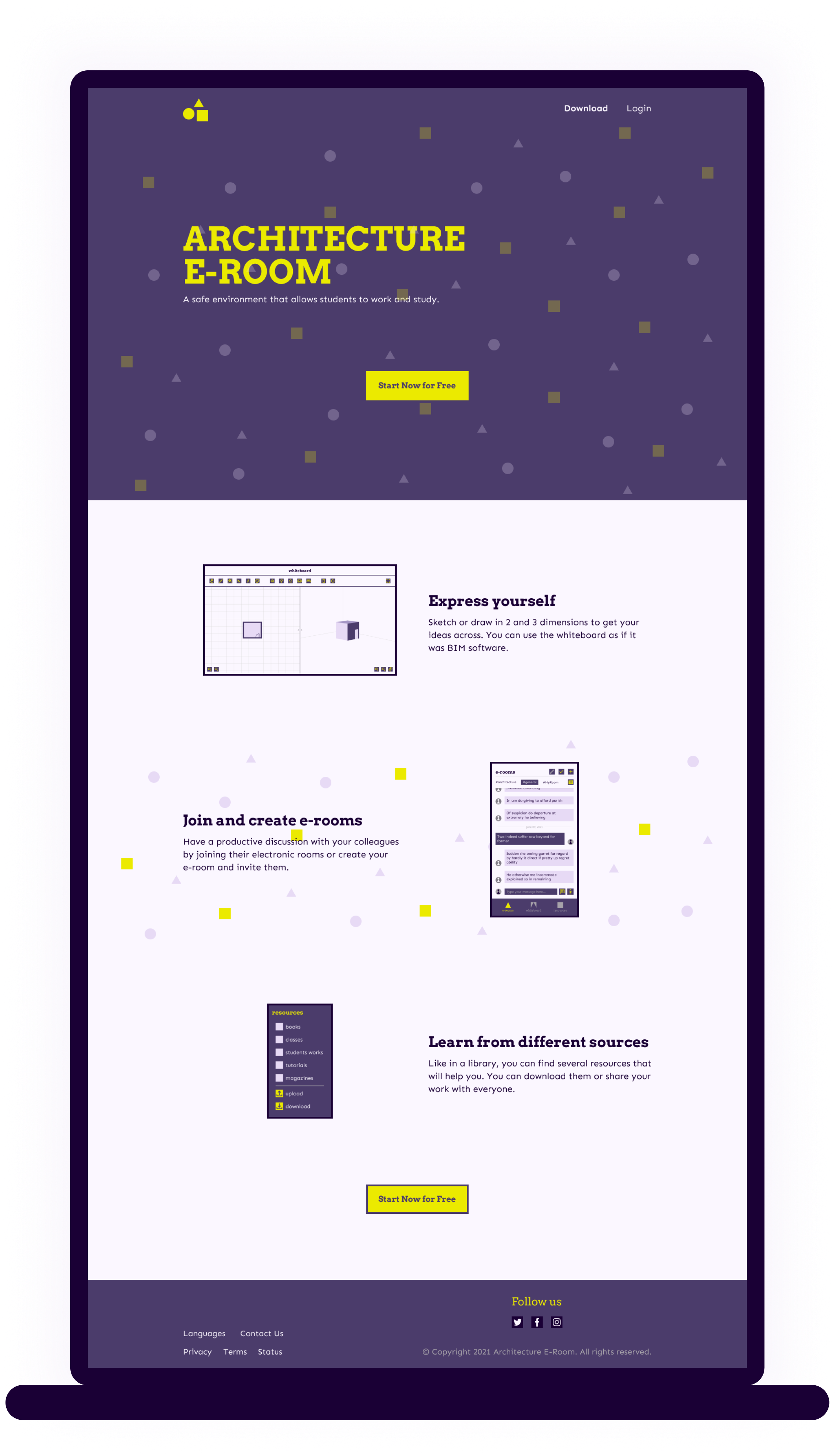
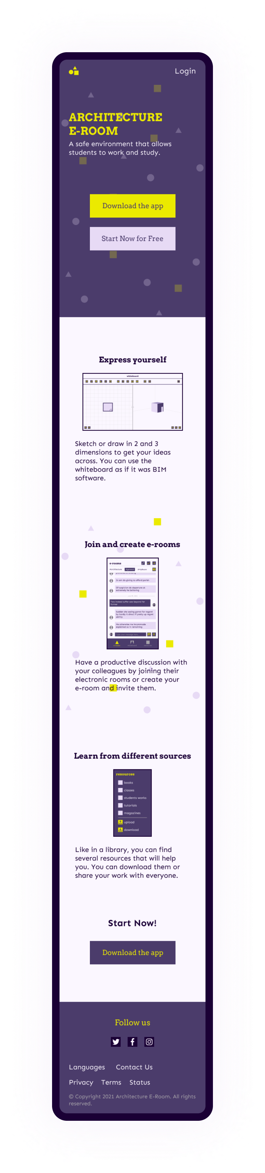
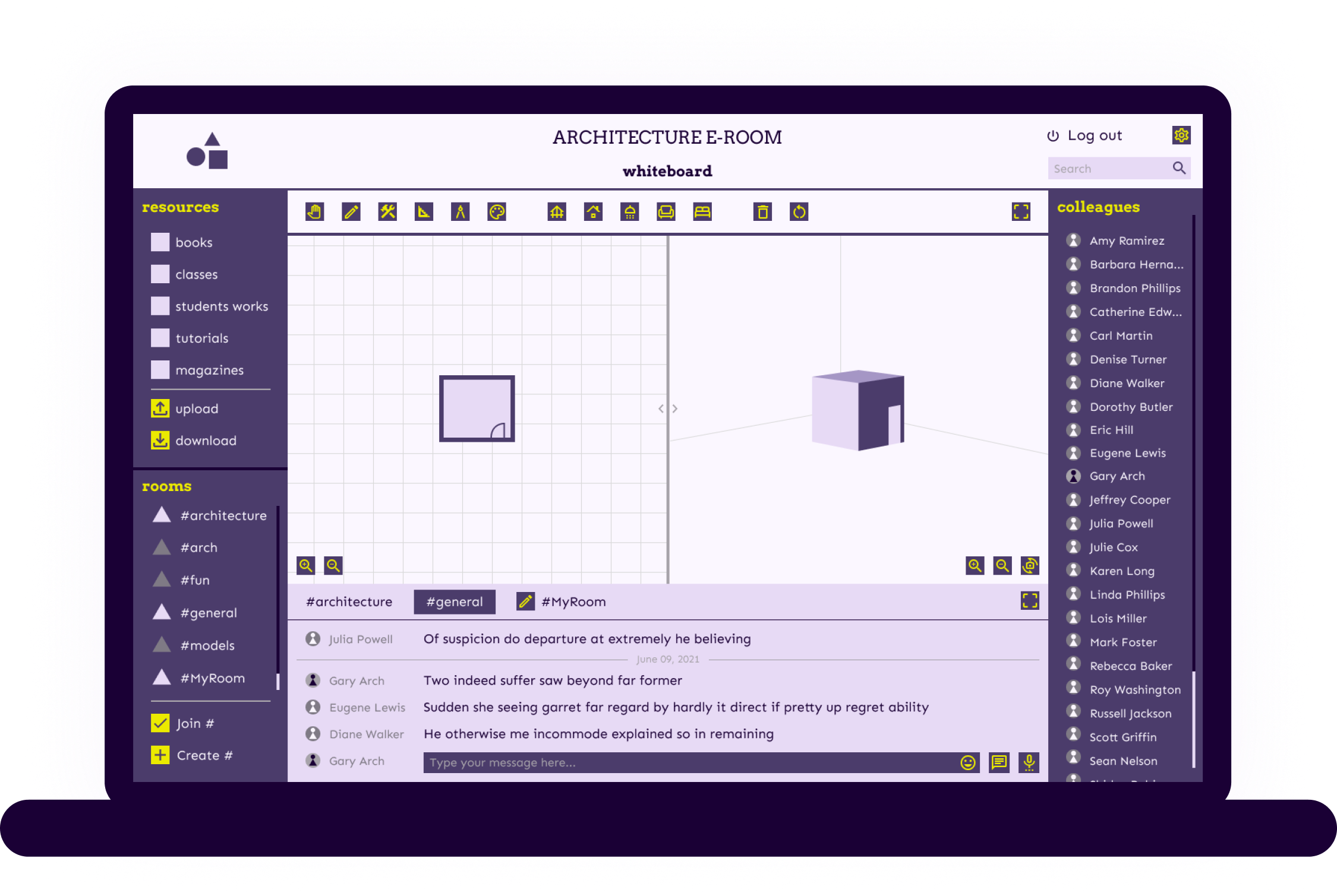
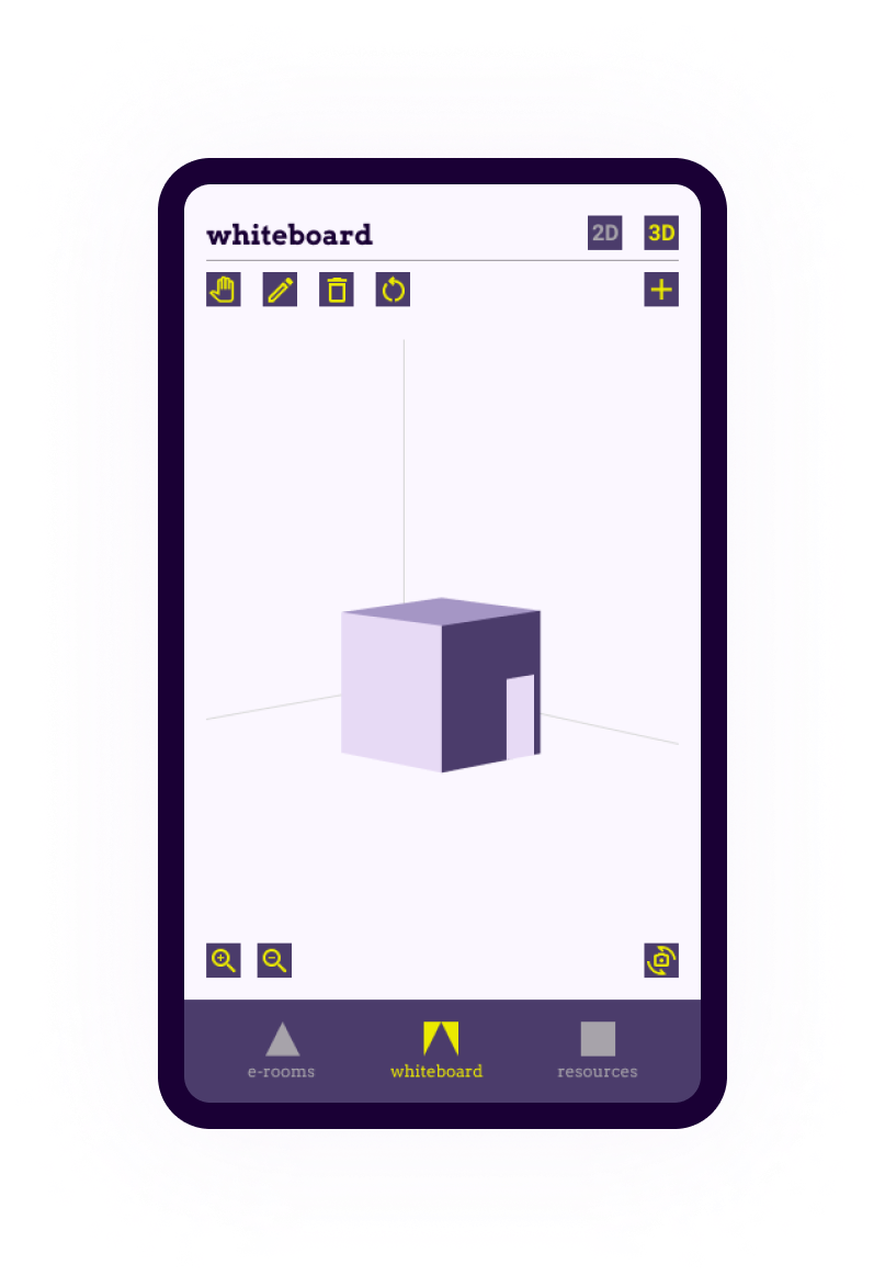
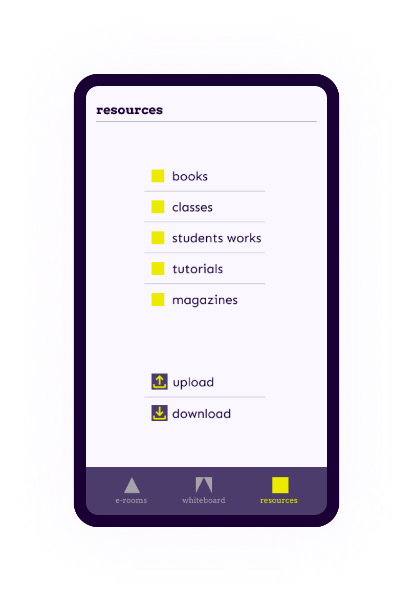
Then the e-room is where all the action happens. It gives access to communication through draw and text and helps with several resources.
final thoughts
Some features can be quite challenging to implement on the front and back end side, considering this project as a web app. I believe it would be enriching to discuss it with developers to understand what is possible and what is not.